Logo Design: The Case of Hillary Clinton
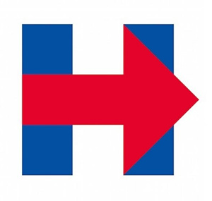
Do you like the logo presented by Hillary Clinton with the official announcement of his run at the White House?
Surely everyone can judge according to their own personal taste, but there are some details that have a clear psychological value and that in a world where virtually everything is played can count a lot.
Numerous graphic designers around the world have expressed their perplexity and we join their team.
But let’s see why:

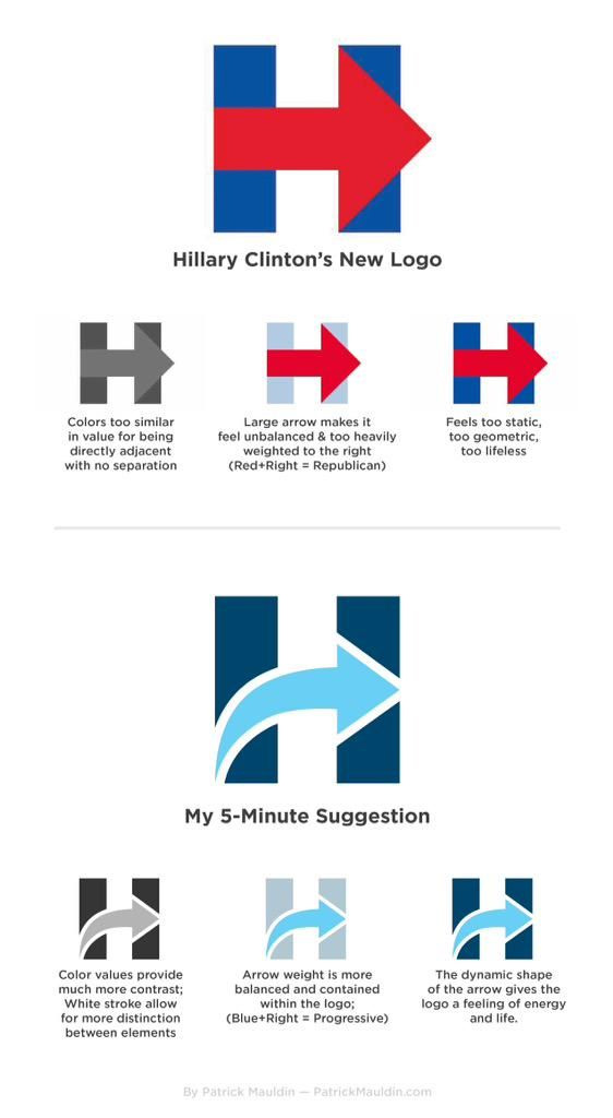
– the arrow is red in color, in the United States associated with the Republicans, that is the Conservatives, while Clinton is the exponent of the Democratic Party = the Progressive;
– The arrow points to the right even though the Democrats represent the Left, but it’s ok because the Western languages are read from left to right and then the arrow seems to point “forward”, pointing to progress.
However, the arrow could also point “up” and be more dynamic. Instead, we are faced with a bit heavy jerk.
Someone came to associate the logo with the tragedy of September 11:
Hillary opponents have turned her logo into the twin towers because of course they have pic.twitter.com/Gqpp2SvIgS
— Olivia Nuzzi (@Olivianuzzi) 12 Aprile 2015
Others find it too similar to the road sign indicating hospitals:
Finally figured out what the Hillary logo reminds me of pic.twitter.com/rFF47dUlWR
— Nate Cohn (@Nate_Cohn) 12 Aprile 2015
And there are those who, on the basis of the Clinton logo, have built a whole typographic font:
Hillary Bold. Because, America. You’re welcome. pic.twitter.com/Y2HRzM4tMn
— Rick Wolff (@RickWolff) 13 Aprile 2015
Among the many remake proposals, we point out this thought in “5 minutes” by Patrick Mauldin:

